Battle of the fonts
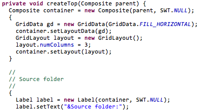
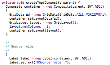
| I decided to revisit my choice of programming fonts recently, mostly inspired by this article. After trying the various fonts in this article, I narrowed down my choices to Consolas and Inconsolata. Here is what they look like: Consolas 12 | Inconsolata 12 |
|---|---|
|  |  |
| Inconsolata 13 |
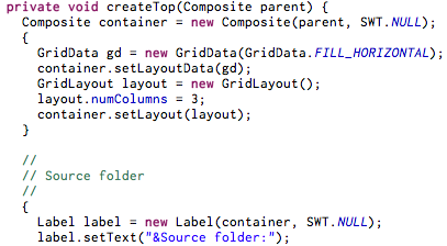
They all look great in Eclipse. The Inconsolata font is freely available but Consolas is a bit more tricky to obtain on Mac since it’s a font created by Microsoft and usually shipped with Microsoft products.?? Here are instructions how to install it on your Mac. Any other suggestions for good programming fonts?
Comments (17)
I like to use DejaVu Sans Mono. Looks great imho. terminus is also very good, but it's not good for very small font sizes (<12). Cheers Thomas
I used "Andale Mono" (available from Microsoft's 'Core fonts for the Web' package) for a long time, but currently I'm back to "Lucida Console". I really really wish fractional point font size existed: to me 7 is too small but 8 is too big... I tried "Comic" once for the fun of it... Didn't last long ;)
Just a note about a peculiarity with font sizes; a font's size, in points, is only meaningful with that font (or font family). For example, you can't say anything meaningful about 10 point Times Roman and 12 point Lucida; the 12 point Lucida might be bigger, or it might even be smaller.
Droid Sans Mono is a great coding font.
I like Vera Sans Mono -- and that's the one I've been using for years. Someone mentioned DejaVu which is pretty similar I believe. In your samples in your post, you should be showing the letters which are usually problematic: 1, l, I, i, as well as 0 and 0. If you can distinguish them easily, then that's a good programming font :-)
I'm fond of Anonymous Pro 2009: http://www.ms-studio.com/FontSales/anonymouspro.html I've also used Inconsolata, and been pleased with it.
Just switched fonts as well based on the same article - to consolas. 12pt though? Seemed way too small after first trying 14pt. Not as large as I've traditionally had them set but so far liking it a lot - looks extremely crisp. You must have at least 10 yrs on me, don't know how you look at 12pt unless you're secretly pimping glasses / contacts er something.
I used to use Consolas at work on Windows, and I did like it. At home on Ubuntu Linux I used Inconsolata, but I found I wasn't satisfied with the anti-aliasing at small sizes. In your Inconsolata screenshots you can see the upper and lower bars on the equals signs look different: the upper bar is all blurry. That kind of thing really annoys me, and I find it gets really bad at small sizes. So I gave up on outline fonts for programming and switched to a bitmap font called Monte Carlo. I really enjoy being able to fit more code on the screen. In fact, I like it so much that I now use it on Windows too. I'd still like to find a monospaced font that still looks clear and sharp with sub-pixel anti-aliasing at small sizes, but I think this requires extremely good hinting and I haven't seen anything I'm satisfied with yet.
Droid Sans Mono 10
I know this may sound like blasphemy, but have you considered variable-width fonts? I've been using Corbel happily for many months now.
Misc fixed 10. Works very well in emacs.
I'm also
I'm also a long time lover of Dina, which got mentioned in the comments of the article a few times.
I used to use Consolas but I've been using Monaco for the last ~1.5 years. Monaco 11 for Eclipse, and Monaco 12 for Terminal and TextMate.
I am currently using ProggyTT. http://www.proggyfonts.com Only one size, but this is very well done! Crisp and exactly the frills I want.
Nice fonts right there. Thanks for the link! I have been a faithful user of Droid Sans Mono, and I guess, it's time for change! Thus, let it begin! =)
Arial is often overlooked, but it is a clear and readable typeface. Bitstream Vera is a free font developed for the GNOME project but is available on other platforms.